
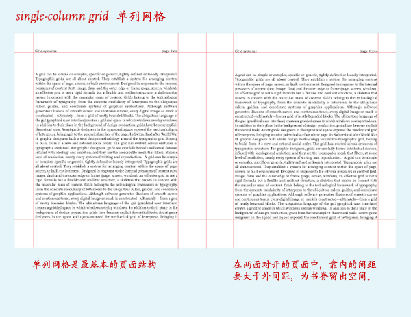
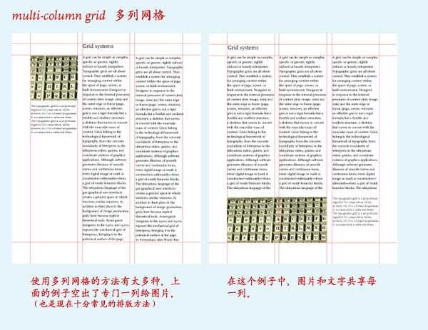
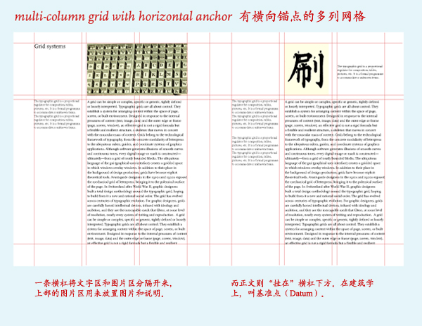
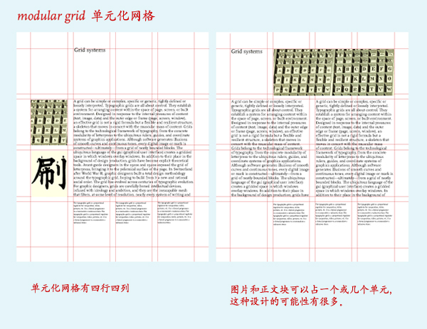
网格(Grid)设计的吸引力是无法抵挡的,尽管很多时候意识不到。上面是最基本的书页设计的网格。以后抽机会讲网格在网页、平面设计、信息设计等等的应用。
Images: Thinking with Type, Princeton Architecture Press. Modified for Chinese captions.
推荐的书目是大师 Jan Tschichold 的《The Form of the book》(尽管观点不同),还有以上例子的来源,这本 Ellen Lupton 的《Thinking with Type》。
14 个相关讨论
真是非常好的例子
希望以后可以多多看到这方面的介绍
谢谢
有用的资料。非常感谢
这些资料是从哪弄的啊?要是能分享下就好了。
to required: 资料一般都编译自我们文章后面推荐的原版书目内。
again, as i said, the form of the book is more about classic typography. i dont think it is suitable here. Grid Systems in Graphic Design by Josef Muller-Brockmann is more appropriate sample of modernist gird layout. also book design by Andrew Haslam
for classic book layout. the form of the book obviously is fab. also Book Typography: A Designer’s Manual by Michael Mitchell has more modern point of view.
hope these info helps.
上面sy说的书我们大部分都会cover到,观点保留。:)
越复杂的网格越迷人….
i dont agree. grid is just a guidance .
谢谢sy的资料
to sy: oh jesus give us a break… even potato knows nothing can go extreme…
who is “us” my mr. potato?
required朋友:
这几个图片资料国内有一本叫做《字体设计指南》引进书上有的,上海人民美术出版社。
Sy朋友:
你提到的Michael Mitchell包括他那本书这里能否简单介绍下,谢谢。
果然是基础,其实就一本书而言,规矩往往并不具备绝对的权威性,那些制定规则的人总是使文字排版设计陷入程式化。文字排版的最大魅力往往从版心的确定就开始了。从版心的设定开始,到网格的搭建、字体的选择、字号、字距、行距等等到图片与文字的相互关系以及各种功能和内容的文字模块的处理,应该是书籍设计师陶醉或者被折磨于其中的巴别塔。我要说的是以上种种细节的处理其实是很个人化的,我们不应该受限制于诸如此类的种种规则中。
我认为上文提供的只是一种基础的观点,并没有将其说成规律性。而且本站大多观点都是偏向于排版的功能性,只是从更理性的角度去思考问题吧。
字体 排版是最白开水的设计。
一个 Trackback
[…] Rex 发表的上一篇网格设计的文章,我希望能够加一些注释。 […]